Blue Ocean Society is a non profit organization with a vision of “thriving marine life in the Gulf of Maine with citizens committed to environmental stewardship.” A desire to do more hands on work to protect marine life turned into programs such as beach cleanups and whale watching as both a research platform and a way to educate.
Challenge: Our goal was to build a platform that communicates their core value and passion of conserving the ocean and marine life to users and inspire them to want to be involved with the organization by volunteering and/or contributing donations.
DURATION:
2 Weeks
CLIENT:
Blue Ocean Society for Marine Conservation
ROLE:
Storyboard, UI Design
Current Website

In need of stronger and effective impression of the organization.
Current Sitemap

Current site has too many sections in the navigation, which could be overwhelming for first timers. We moved the secondary features like Shop, Blog and Contact us to the utility section, to clear out the menu for easier navigation. We also created a Donate and Volunteer section that calls users to action and emphasizes the main feature of their website.
Research
Quotes from users
“Too many menu items”
“From the homepage, I'm not sure what the website wants me to do.
It seems like a great cause though.”
“I was overwhelmed of the long paragraphs of bullet points. It's difficult to scan.”
“There is a lot of information on the website. It was easy to navigate if I knew a particular area I was looking for.”
Understanding the user problem
01.
Too many menu items are overwhelming for users who do not have a specific goal in mind when visiting the site.
02.
No clear call to action for the key features - The ‘Donate’ button blends in with the navigation menu.
03.
Most contents are laid out flat without much visual support, and it’s neither visually appealing nor user friedly.
User Persona
We built a persona for our interviewee from the organization.

Storyboard
We created a storyboard based on her past experience of the current website and added a possible future outcome with the new website.
Project Perspective
01.
Rearrange the navigation menu items for easier navigation.
02.
Create a clear call to action as well as a clear and concise navigation for the user.
03.
Design a more visually appealing and user friendly web page that will engage and inspire users to be involved.
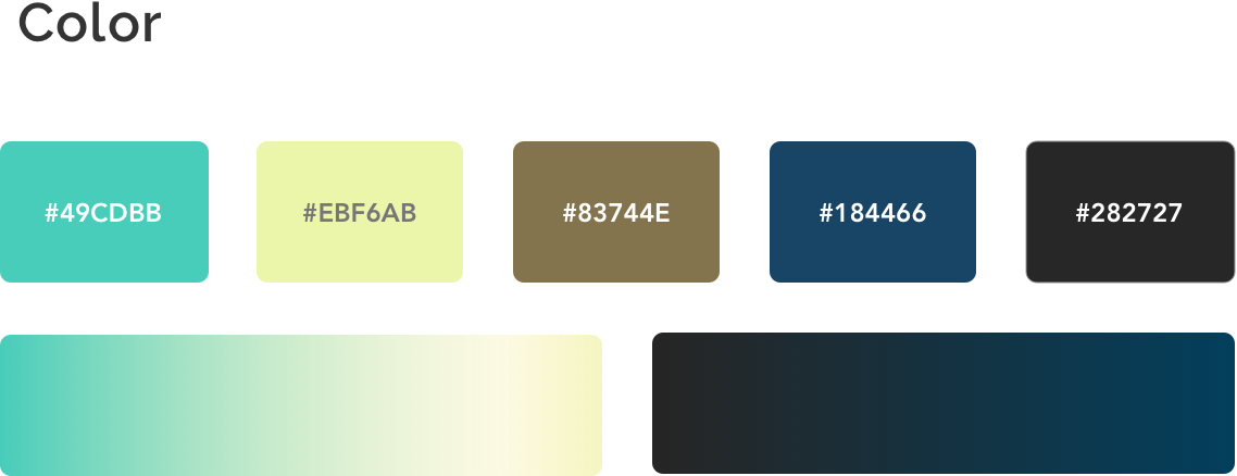
Styleguide


To highlight and visually represent the main options, I customized each icon.
Homepage
The homepage concept was built around the idea of engaging users with a strong impression about the organization’s identity with narrative visual support and clear content.